Level Conversion
You may have a record level data file, which contains a row for every sale or every customer or every postcode. In order to plot the data in this file the system needs to convert your data to either postcode area, a district or a sector. This conversion to a higher level is known as aggregation and will create a new summary dataset for you at the new level. If you convert to postcode area, then all the values on the rows with a postcode within an area will be automatically added up.
- Getting to the conversion page
-
The conversion page is an extra step which appears in the map wizard. It is shown if you try to plot a dataset that is at postcode level or record level.
To get to this page you can either:
1/ Click on the name of an existing dataset that is at postcode level. On the datasets screen the 'level' column in the table should read 'postcode'.
2/ Select a dataset in the map wizard that is at record level or postcode level.
3/ Upload a record level dataset from either the wizard or by selecting 'upload new dataset' from the menu on the datasets screen.
- Select the Level to convert to
-
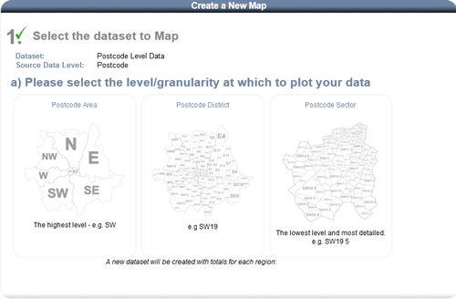
Select the level at which you wish to plot your data (by postal area, district or sector).
The system will create a new dataset at the level you have chosen.
Record level rows will be grouped together based on the level you have selected. The values in this new dataset will be automatically calculated by adding up all record level values for the rows in each group.
- What is the format of your record level file?
-
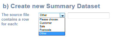
Select whether your record level source file contains rows for each Customer, Sale, Postcode or Other.
If it is customer data, then the new dataset will contain a field called 'customers' which is the total number of customers in each postal area, district or sector.
If it is sales data, then the new dataset will contain a field called 'sales' which is the total number of sales in each postal area, district or sector (depending on the level selected).
If you chose 'Other' then you can enter what each row represents, which will be used as the name for the row count column in the new dataset.
- Give your new summary dataset a name
-
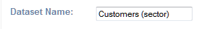
Enter a name in the 'Dataset Name' text field.
Make sure this is a unique name. If you have already used this name for another dataset then you will be told to enter a different one.
- Configure the summary data fields
-
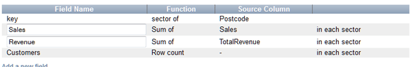
Any numeric fields will automatically be added to the new dataset as a Sum (of all the rows in the group). You can change the name of these columns.
In the example above 3 summary fields have been added automatically.
1 is a column called 'Customers' which is a count of all the customers in each group/area (in the record level source file).
'Sales' and 'Revenue' are added because they are a total of the sales and revenue columns (in the record level source file).
If you are happy with these columns then click 'Next' to choose which field to plot.

If you wish to add another summary column then complete the next step before you click 'Next'.
- Add a custom field
-
(This is optional)

Choose the source column from the drop down. In the example above 'sales' is the source column.
Choose the calculation such as SUM or Average. In the example 'Avg (Mean)' is chosen.
Enter a name for the new column. In the example above it is 'Sales per Customer'.
The 'Mean' calculation is the Sum (of the column for all the rows in the group) divided by the number of rows in the group.
In the example above 'Mean Sales' would be the average number of sales per customer in each area. Therefore we named it 'Sales per Customer'.
Click 'Add', which will add the field to the table above.

Click 'Next' when you have finished adding custom fields.
- Choose the column to plot
-
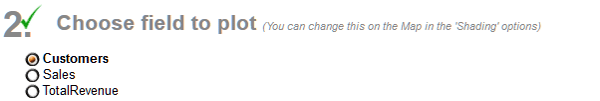
You are now on the last page of the map wizard.
Click on the field you wish to plot.